Brand Guide
Concept design for the hypothetical Yuba City Zoo
Brand Guide
Concept design for the hypothetical Yuba City Zoo
Playful
enjoyable
memorable
ABOUT
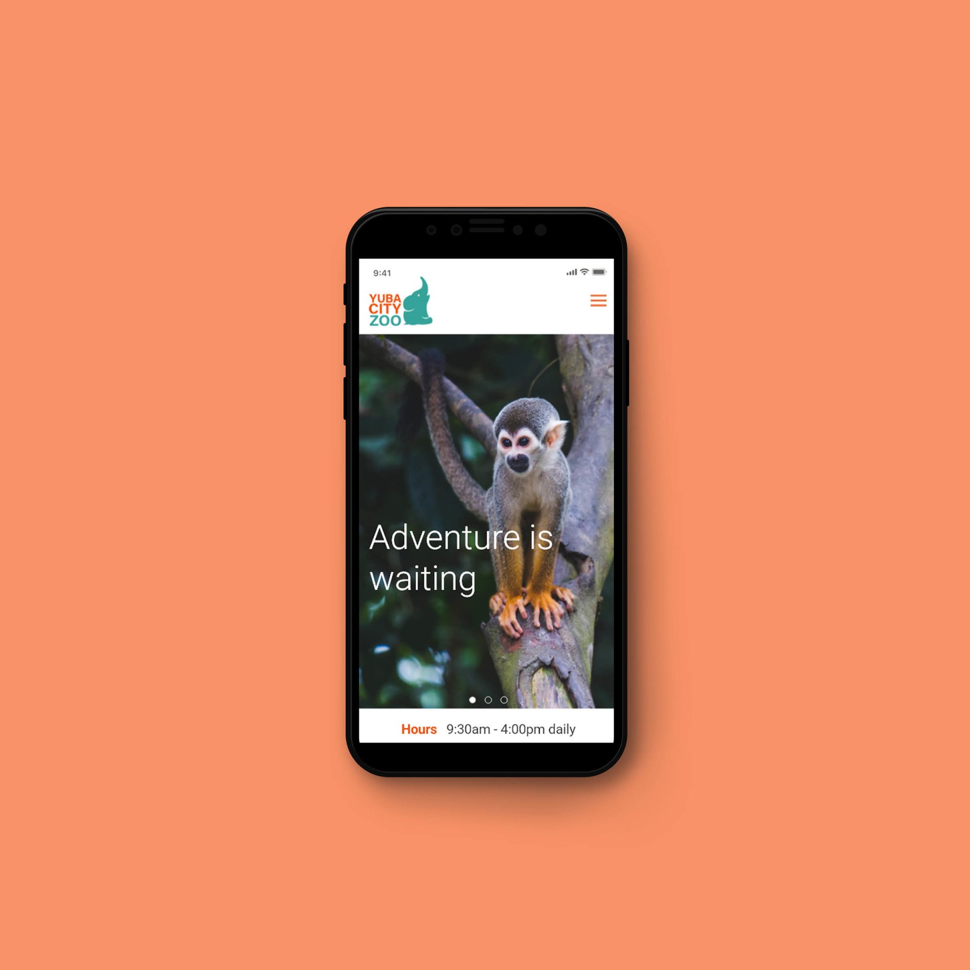
This project is a concept design for the hypothetical Yuba City Zoo brand. The Yuba City Zoo is the largest zoo in the United States spread over 710 acres. It has one of the most diverse collections of animals of any zoos in the world with over 5,000 animals representing over 450 species.
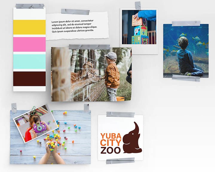
Mood Board
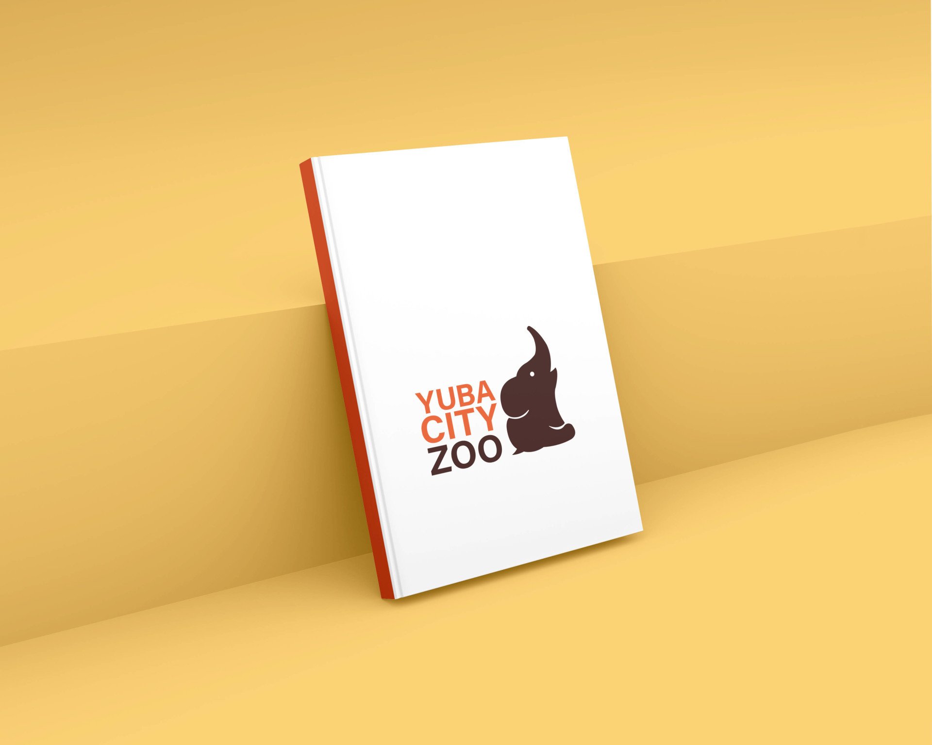
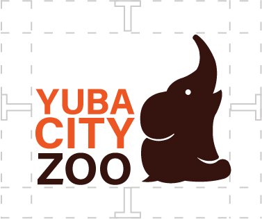
PRIMARY LOGO
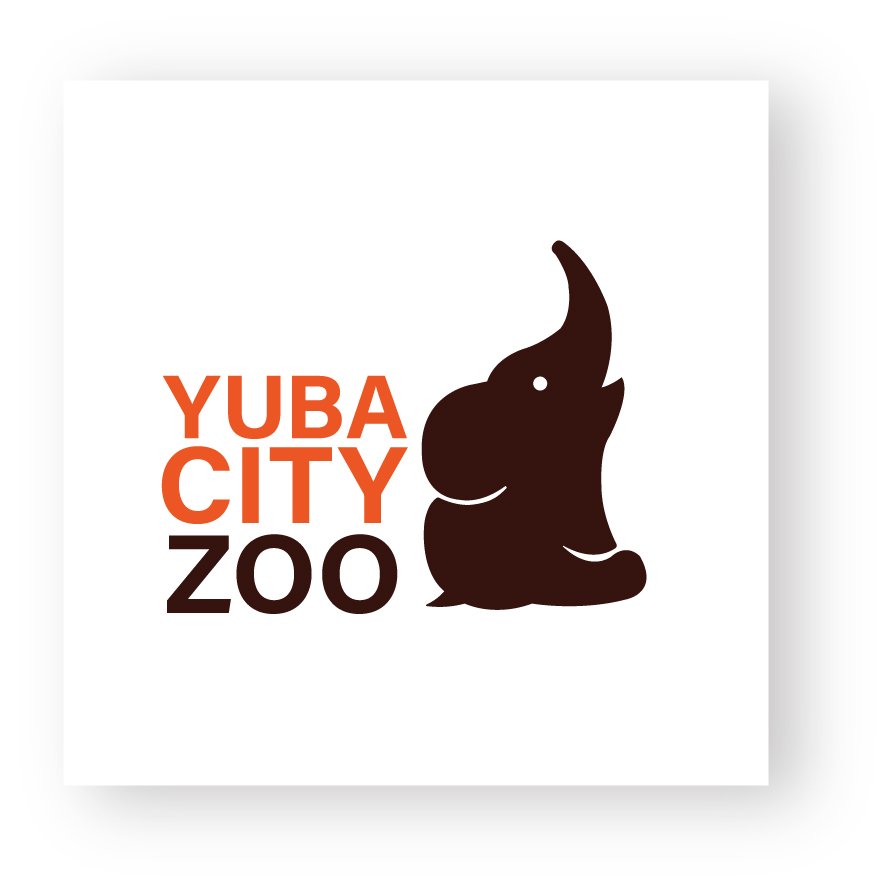
This logo will be used across primary brand applications including signage, web presence, ads and other materials. It is essential to the success of the brand that the logo always be applied with care and respect in every application according to these guidelines.
It should be noted that to scale down the logo to fit in a small space, the primary logo willl no longer suffice and the secondary logo should be utilized.
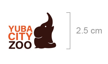
Minimum Size
The smallest the primary logo should be represented is 2.5 cm high for legibility.
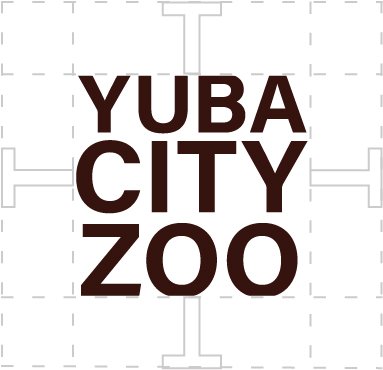
SECONDARY LOGO
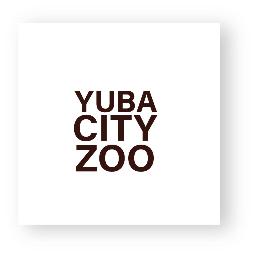
The Yuba City Zoo’s secondary logo versions can be used in place of the primary logo but should never be used next to the primary logo. The secondary logo is intended to be used if the logo must be scaled down in order to fit nicely in a small space provided.
PROXIMITY
TYPOGRAPHY
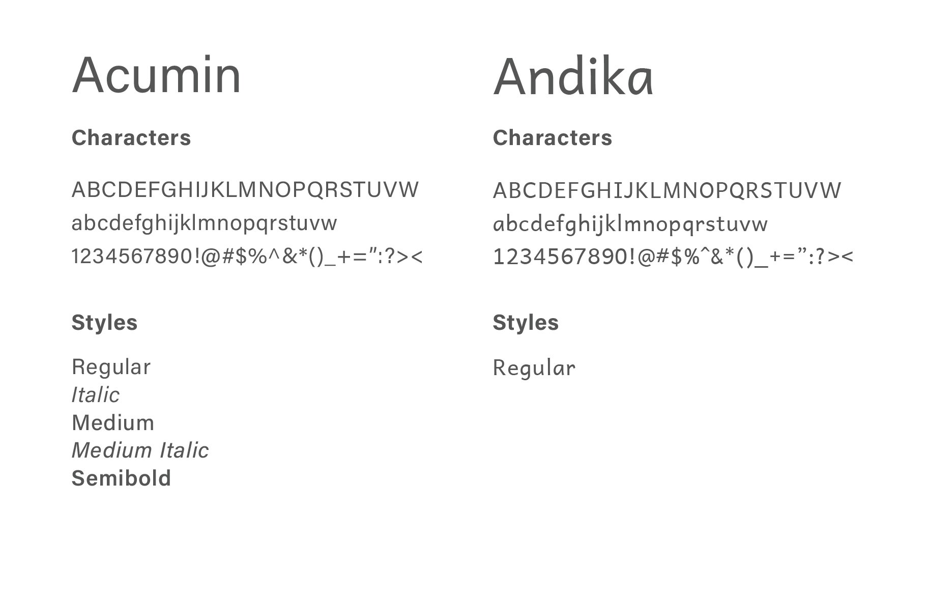
The primary typeface that is used for the Yuba City Zoo is Acumin. It’s a clean, modern sans-serif typeface that works well for display copy, body text, and everything between. Andika is the secondary typeface that draws the reader into the design and is used sparingly and tastefully as a large accent element in the design. This font may be used when you need to create a mood or set the tone of a piece. Typically used for type set larger than 14 points and only be used for headlines or graphics.
PRIMARY COLORS
The primary set of colors are used in the logo. These are the base colors to be utilized throughout the Zoo. This includes print collateral, digital formats and on-grounds signage systems.
SECONDARY COLORS
The colors in our secondary palette, or supporting palette, were chosen to complement our primary palette of brown and orange, providing additional range to the brand experience. The secondary palette colors work well as accent colors or as subtle backgrounds behind typography or graphics.
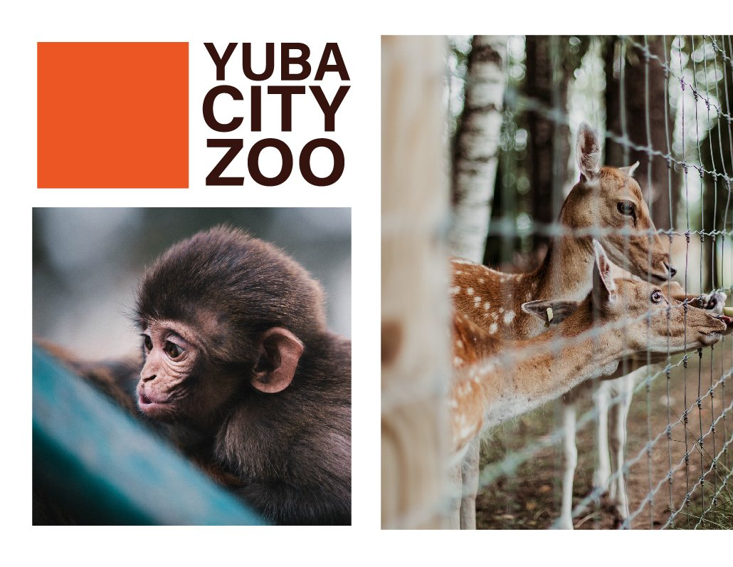
PHOTOGRAPHY
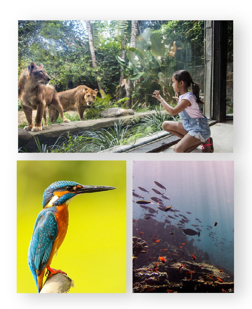
immersive experiences and storytelling.
These points to be considered while selecting images:
Keep it simple. Favor clean, uncluttered compositions. Select images that are immersive and invite viewers into being a part of the moment. Deliver a perspective that’s unexpected. Explore new angles.
Photography Credit: Unsplash
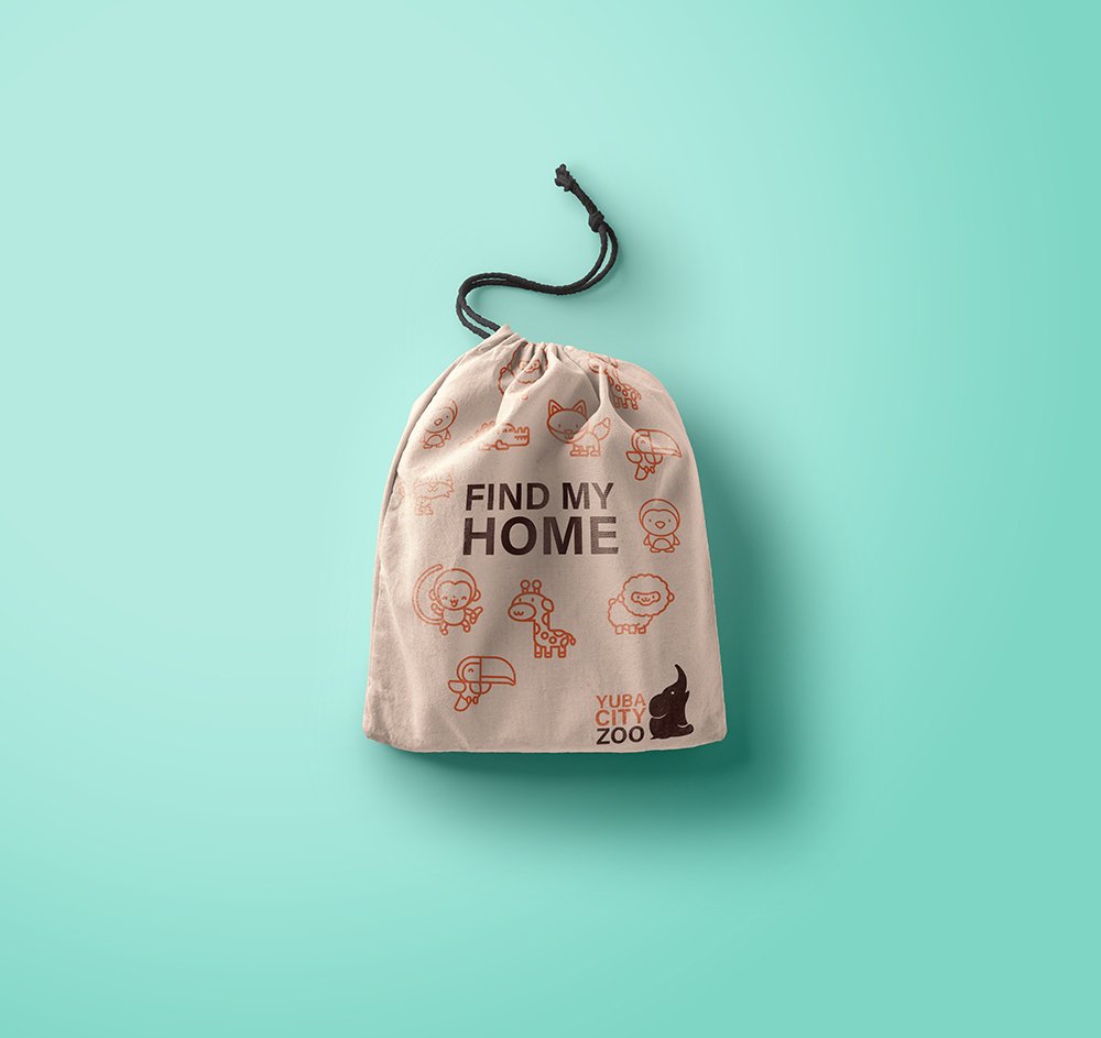
ILLUSTRATION
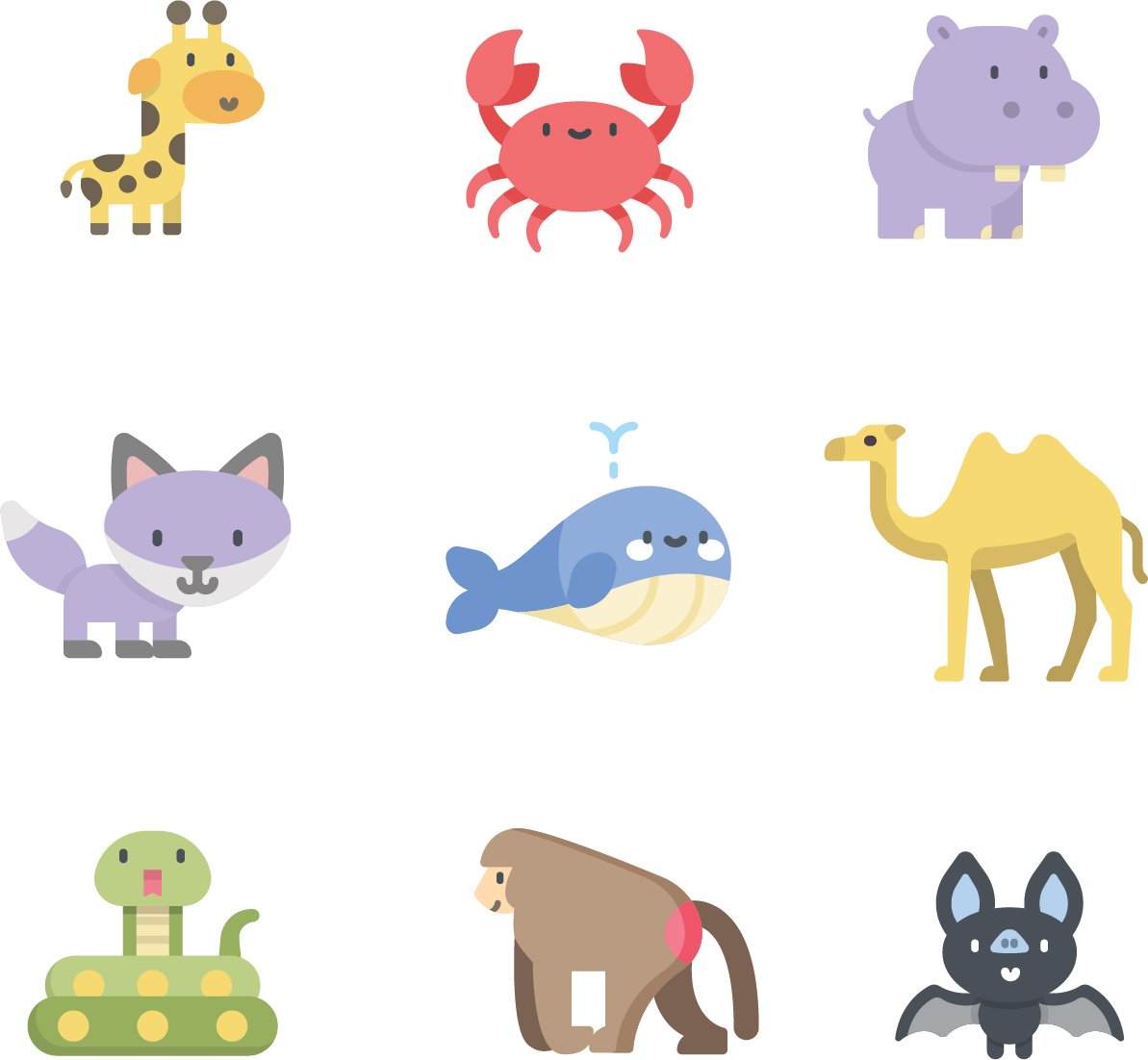
Simple, funny, memorable and friendly. While each illustration is visually distinct, but as a whole they should have consistent visual style.
Illustration Credit: Flaticon
TONE OF VOICE
Cheerful
engaging
warm
distinctive
From our website to social posts to our promotional material, the Yuba City Zoo voice is distinctive, playful, warm and engaging. In our copy, we inspire people to see how the love of nature changes people’s lives. Our headlines are approachable and inclusive. In body copy, our message is clear and simple. We use active voice. We tell stories instead of just citing facts. We share simple ways people can help. And we inspire action. At its core, our voice connects with and invites our audience to be part of something bigger that is changing the lives of animals and the world.