GOALS
Connect children with wildlife and foster their curiosity, and understanding through engaging experiences with the natural world.
ROLE
User Research, UX/UI Design, Development, Testing
TARGET AUDIENCES
Primary: Kids between the age range of 3-8yrs
Secondary: Parents
Woodland Park Zoo, Seattle
Santa Fe Zoo, Florida
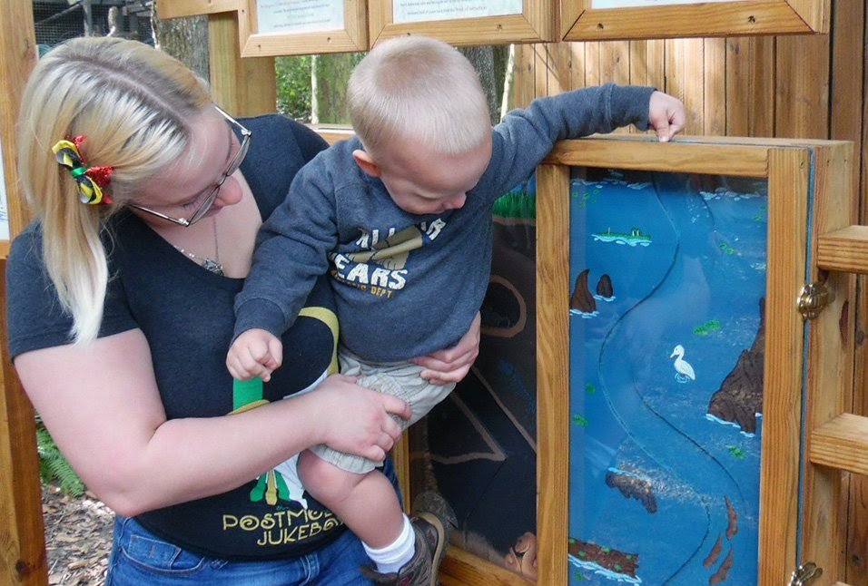
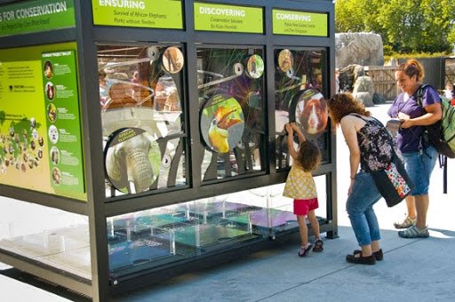
- There are very few kiosk for younger audience in existing zoo space
- Information not presented in kid friendly way
RESEARCH
User interviews:
I started off my research by conducting interviews with parents those who have kids between the ages of 3 and 8 years old. I wanted to learn more about their kids' behaviors when it came to a zoo visit. The interviews were focused to answer the following main questions:
- What is the main purpose they visit the zoo?
- What are the things they like to do in the zoo?
- While watching the animal, how much time do they spend at exhibit?
- What are the things about an animal they are curious about?
- What are the pain points and how do they work around them?
- Was there anything they did not like about the zoo?
- What could be done to improve the overall experience at the zoo?
After careful user research and interviews, I found out that the zoo lacks a visible way to construct thematic narratives around animals. This makes it difficult for visitors to find meaning in their experience as a whole and limits the zoo’s ability to present animals in exciting ways.
USER PERSONA
Using the user research analysis, I created a personas that embody the traits of the target audience.
Name: Sarah Zhang
- Age: 4 yrs
Sarah is highly interested in how things work. There is no stopping her when it comes to learning new things. She is very popular in the playground because she makes everyone play together. She has 25 stuffed animals. Very caring and involved with her younger siblings. She loves going camping with her parents because she gets to stay up late and discover new sides of the world. When she grows up, she wants to be the president, because she wants to help people.
- She has a Language-Based Learning Disability (LBLD). She has difficulty in reading, difficulty with spelling.
SOLUTION
Kiosk design
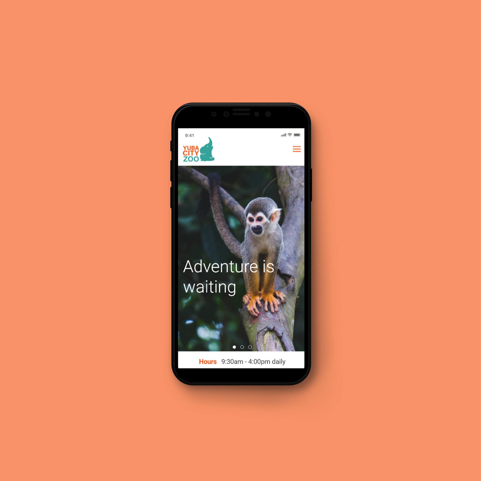
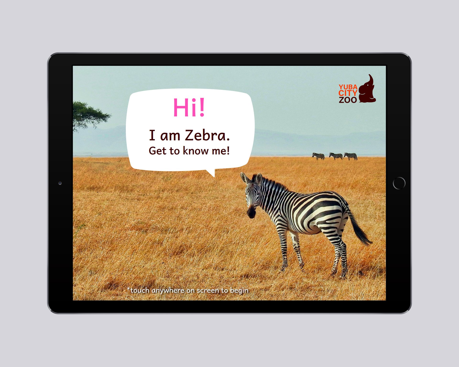
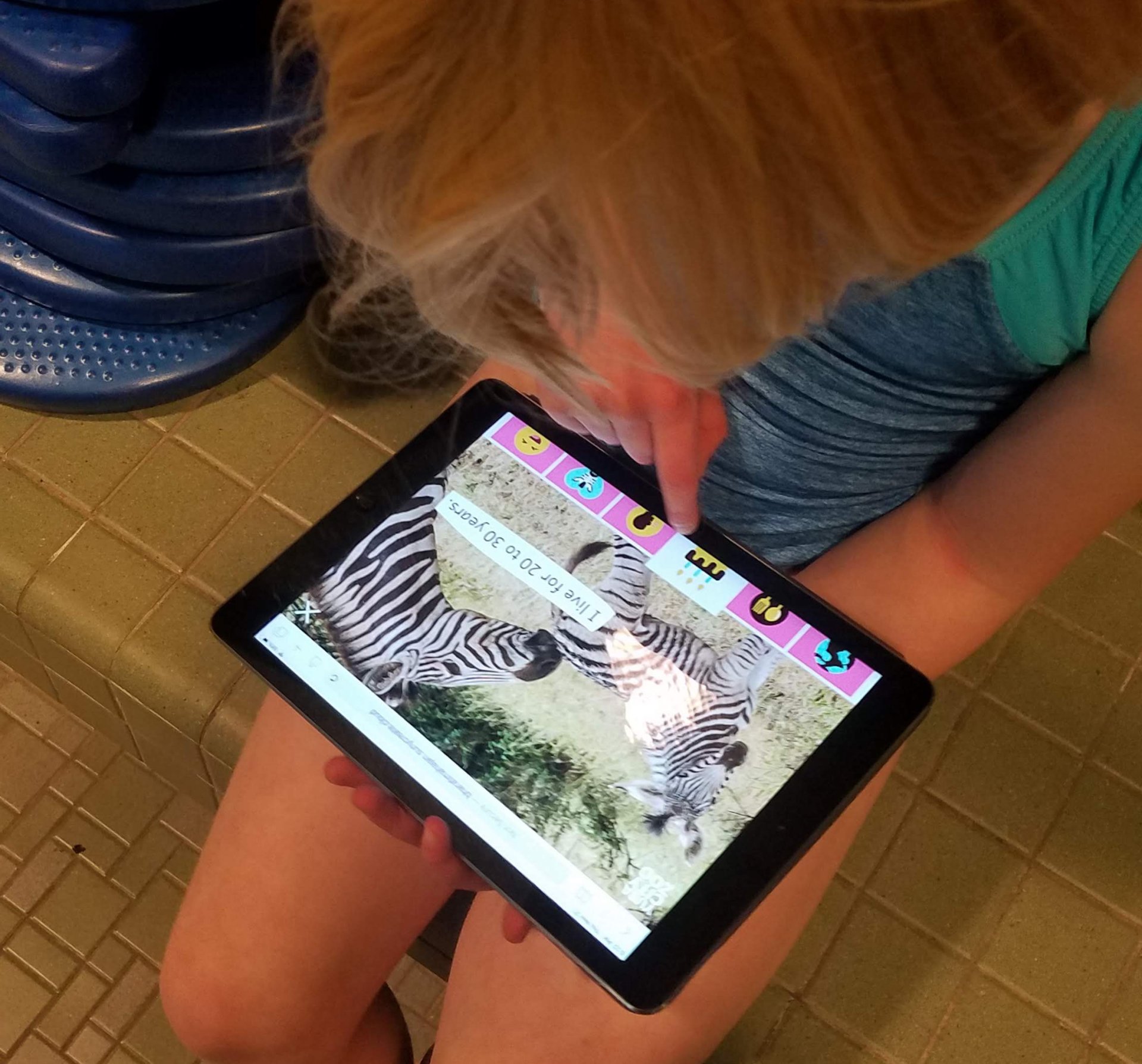
A digital kiosk that kids could utilize to make their zoo visit more enjoyable and memorable. The interactive kiosk will feature interesting information about animals and will educate kids about wildlife. The kiosk will host high-quality content that will couple with the up-close experience of live animals. Kids will have a better understanding of each individual animal and establish a personal bond with them.
Wire-framing
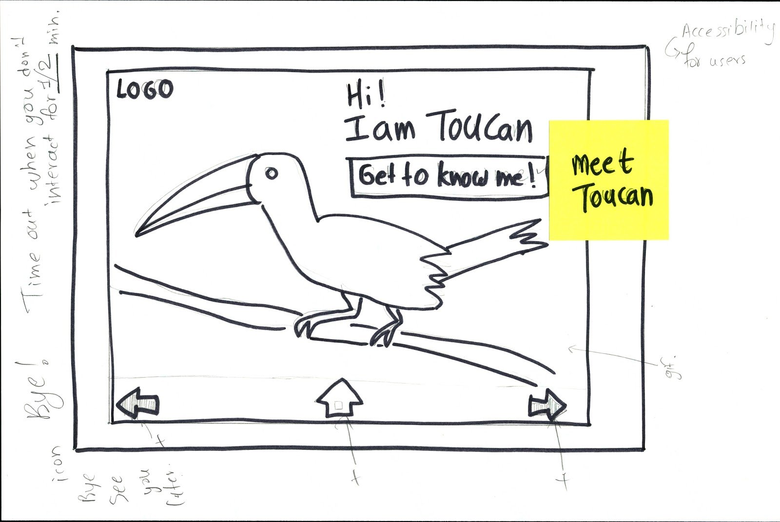
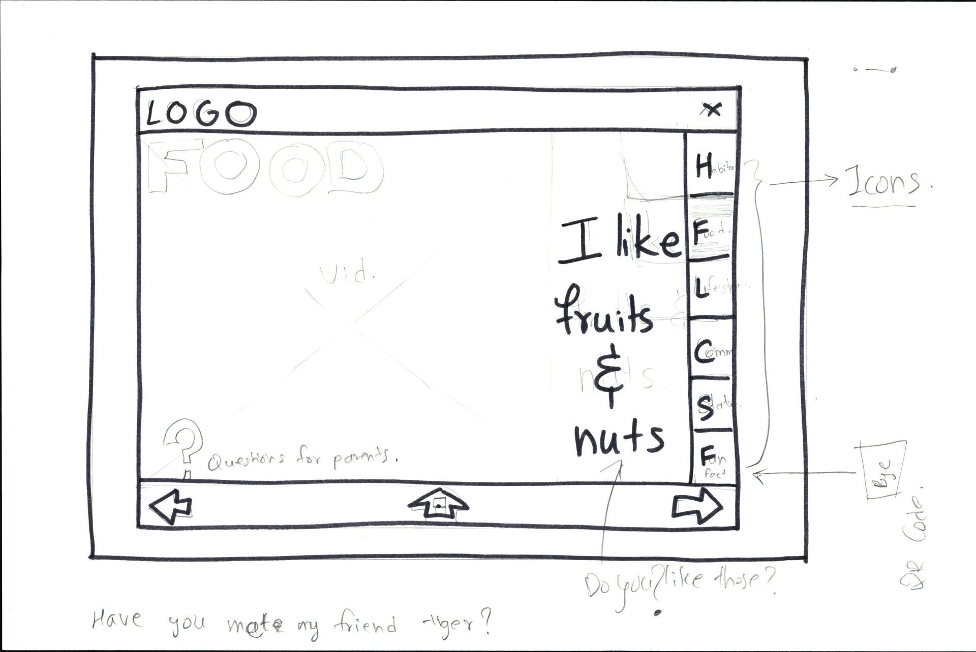
The main purpose of sketches was to draw out multiple flows and explore the different ideas identified in the design sprint. I created low fidelity wire-frames of the ideal flow for on-site kiosk.These wire-frames were tested with the users and some adjustments were made to the language used for interface. Instead of writing in third person, I decided to use first person point of view to make it appear that the animal/bird itself is speaking. Users found this approach more personal.
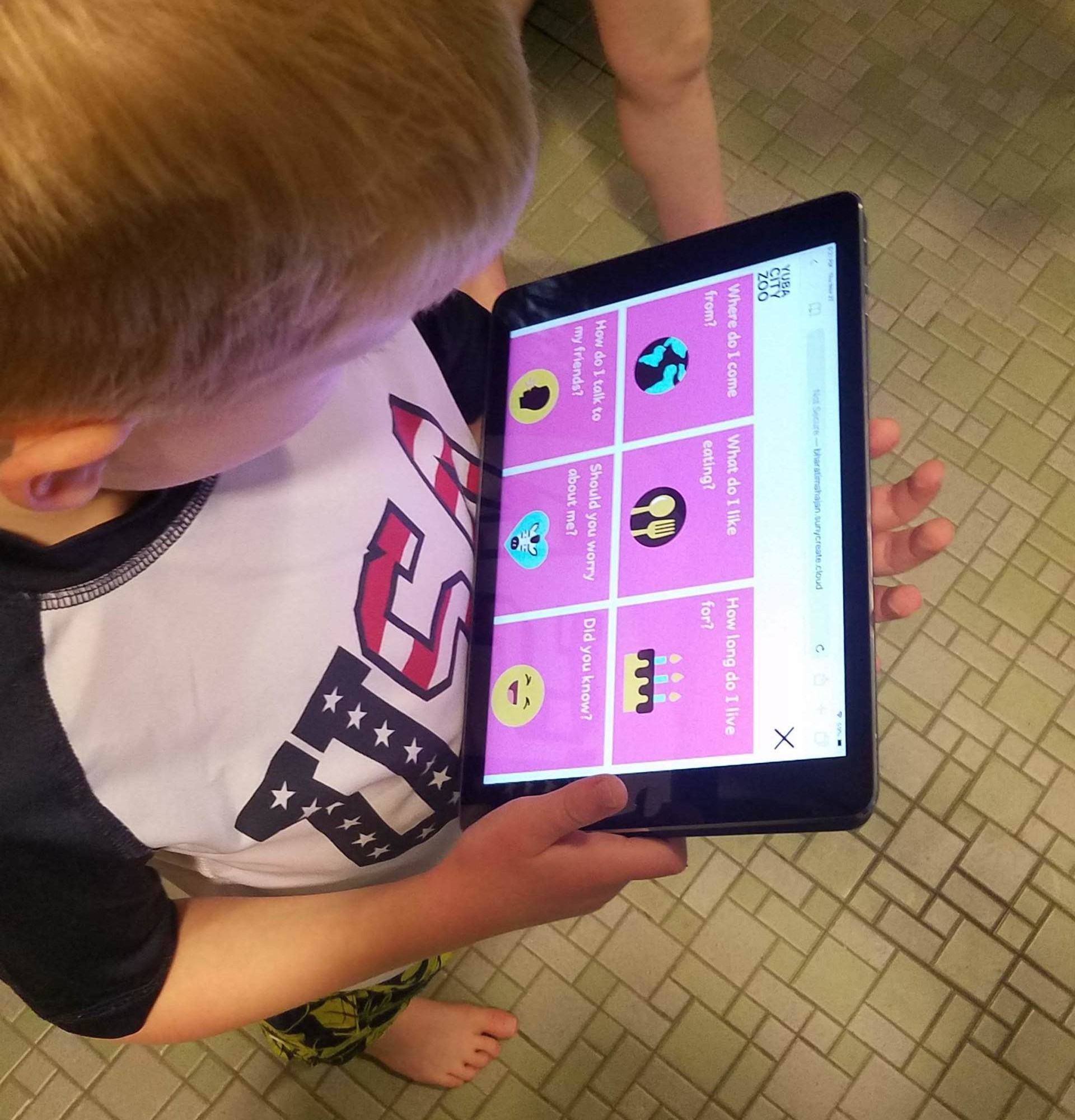
High fidelity prototyping:
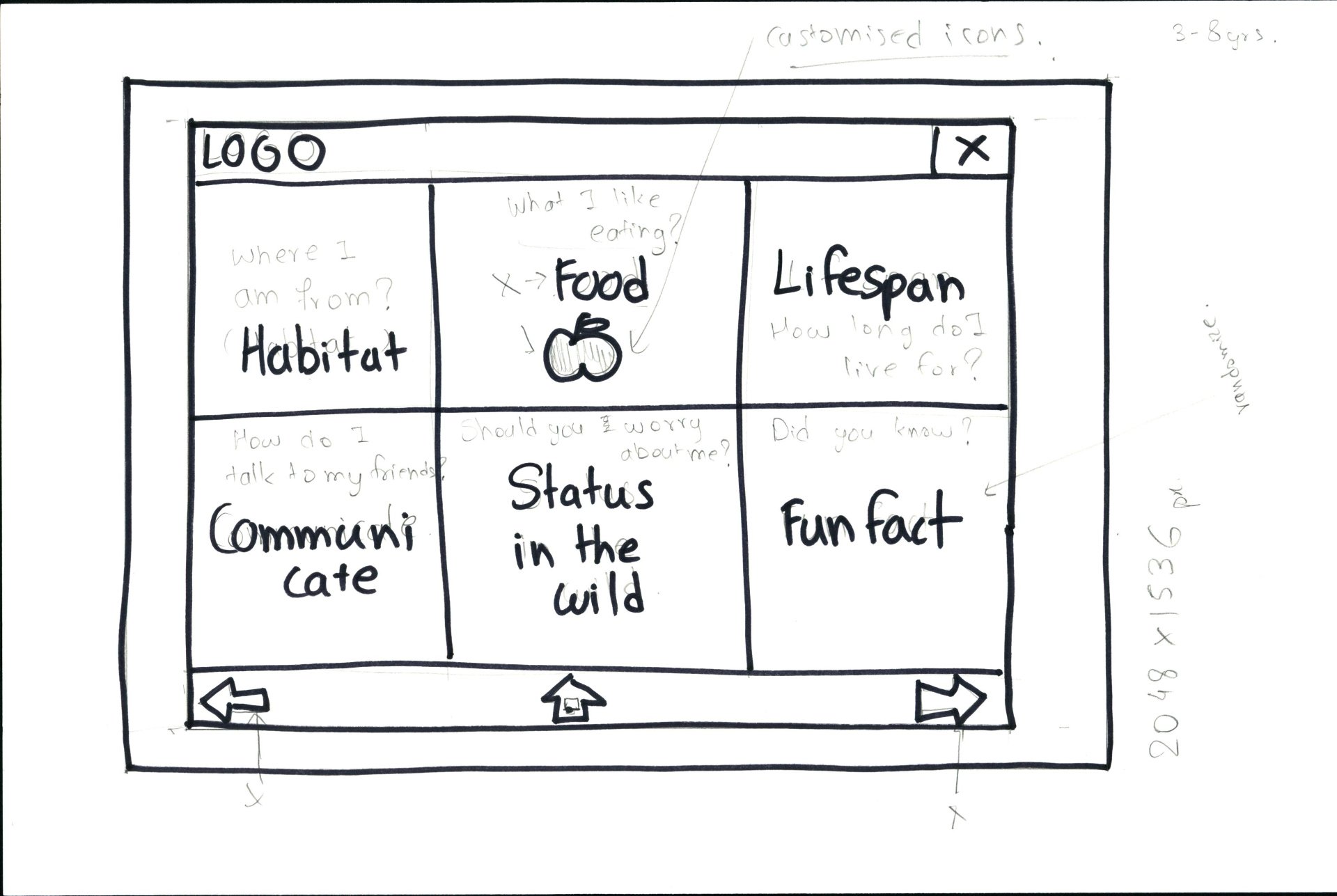
After several rounds of user testing and iterations the wire-frames moved from low-fidelity to high-fidelity prototypes. I tested the prototypes with 4 kids and made some changes. The button icon for ‘conservation’ was changed from the animal paw to a graphic of an actual animal in a heart shape. Icon for ‘communicate’ was changed from speech bubble to a silhouette of speaking kid. children in the age group of 3-5 years haven’t developed a lot of mental models for abstract icons. In this case more direct connection between the idea and icon visual helped.
I changed the button icon for ‘Lifespan’ from clock to a cake as a cake could be easily related to 'How many years the animal lives' than clock.
The ‘Get to know me!’ call to action standard button had a limited tap area which would have been a problem for kids as a slight deviation in tapping would not take them to the next screen. The button was removed, and the entire screen was made clickable for the smoother transition.
Accessibility & Development:
To address the needs of the persona, I created information hierarchies that are clear and based on convention. I made sure the content is in plain language so it's easy to read and avoided "decoration" like underlining. The color values were compared and adjusted using a color accessibility checker to comply with WCAG 2.0 guidelines.
The kiosk incorporated standard web languages such as HTML5, CSS3 and JavaScript with clean and semantic code.
REFLECTION
Challenges are Rewarding
Working within specific constraints was challenging, but rewarding. This project helped me to be more creative, while focusing on the core goals, and designing beyond usability and functionality — designing for meaning and impact.